Betfair Graphs – The Wonder Of A Squiggly Line!

Betfair Graphs – That Squiggly Line…
The wonder of a squiggly line ;-).
That's how I saw a Betfair graph, the first time I clicked on that little button on the left of a horse's name, on a Betfair racecard. “I wonder”, I said!
More like, “I wonder what the hell that is!”
Maybe some of you haven't even noticed the smallest icon in racing?
However, it's relevance couldn't be more important to anyone that wants to understand how the markets work and more importantly, how to make a few quid by being able to understand them!
Betfair Graphs: What is it, Where is it, and How can we use it?
Yup, that little “chimney stack” with the squiggly line above it, is a Betfair graph and in today's article, we're going to see how exactly how you can use it, to not only understand the markets but how you can profit from it.
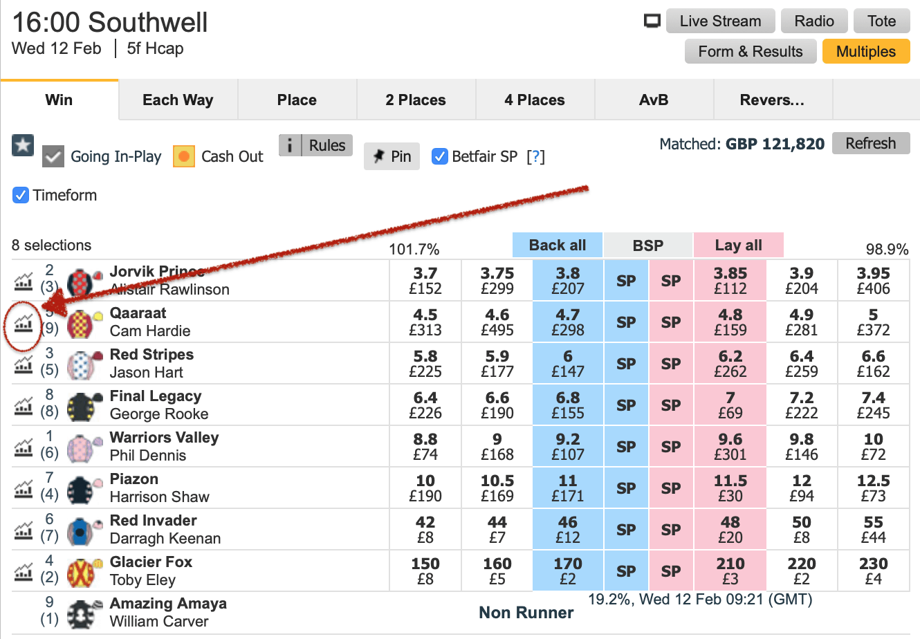
Once you've clicked on that little “chimney stack” you'll be taken to a page that looks like this:
It's the actual graph on the left-hand side that we need to take note of. The figures on the right-hand side are simply stakes that traders have put into the “in-play” market to see what they can get matched. That's a whole different article and something I will look at writing in due course.
Anyway, looking at the graph, above, we have three things to note.
- The red line
- The grey lines shooting up from the bottom of the graph
- The price and volume on either side of the graph
Basically, the red line shows the movement of the odds for the said horse.
The grey lines are the amount of money for our horse, which corresponds with the volume.
Finally, looking at the left of the graph you'll see the price. The red line will go up and down and show you how various prices were matched. Secondly, the grey lines will meet up with the volume side of the graph and show you how much was matched at “said price”.
Enjoying this topic? Why not check out:
> How To Scalp The Betfair Markets
> What Causes Betting Odds To Move?
> Reading Betfair Graphs Like A Pro Trader
If you're still with me, we can no go a little deeper…
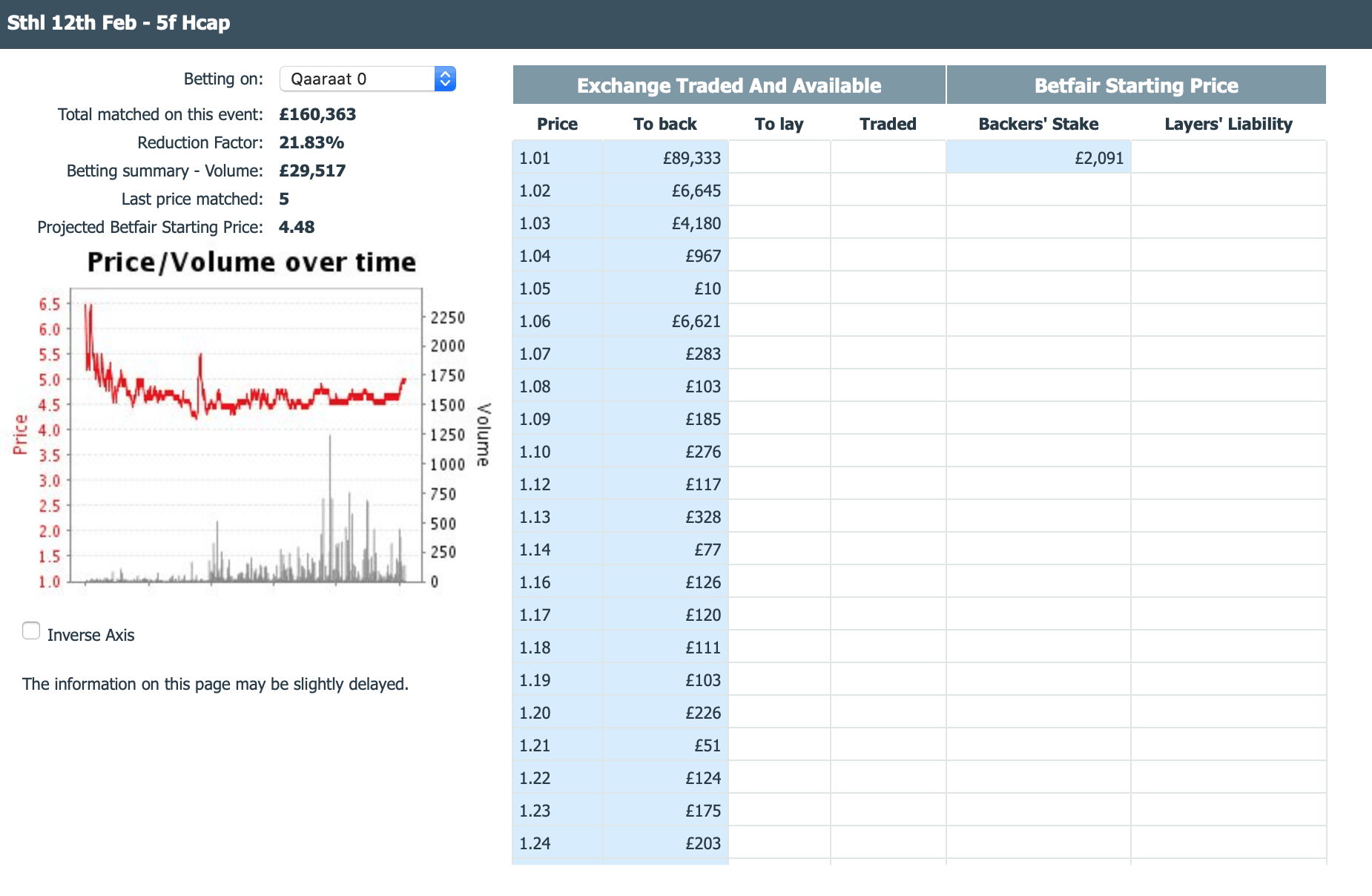
But, one issue that people have with the graph, is that there's no timeline. In other words, looking at the largest amount of money matched in the above graph, which is around £1,200, we don't know if that was an hour ago, 10 minutes ago, or 2 minutes!
And, for this very reason, it's extremely important to follow the graphs “live” when using them. We must monitor them for at least 5 minutes to see where the money is going.
Going Deeper With Betfair Graphs
Rather than ignoring the Betfair graphs or viewing them with trepidation, start learning how to read them. While they are no indicator of future odds availability, you can utilise them to make scalping choices, especially in horse racing. Incidentally, don’t make a trading decision based on one significant spike in the graph.
It is better to wait for a more consistent group of lines before making your move. If you see a cohesive grouping of smaller bets that cause the price to drift, for example, you can be more confident about placing a lay bet in the hope the odds continue to rise.
You can also use Betfair graphs to see if there are any support or resistance points. For example, if Oak Park’s odds keep fluctuating between 1.62 and 1.72. You can use this as an opportunity to scalp. When the price goes to 1.72, you place back bets. When the price goes to 1.62, you play lay bets, and so on.
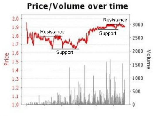
In the below chart we can show you a clear example of a good examples of support and resistance.
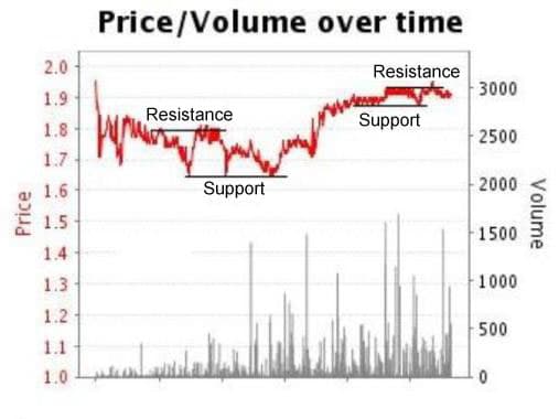
For a long while the selection in question was moving between 1.65 and 1.80. Later in the day, it broke the resistance line before settling again 1.88 and 1.95.
Another way you can use support and resistance lines is through scalping on football matches.
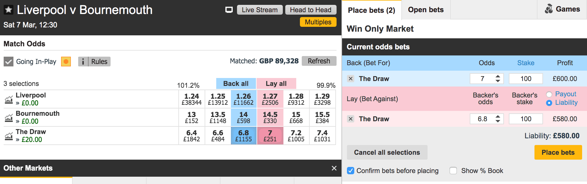
The below example is from today's early kick between Liverpool and Bournemouth. As we can see from the Betfair Chart, there is a lot of money being traded with the price barely moving.
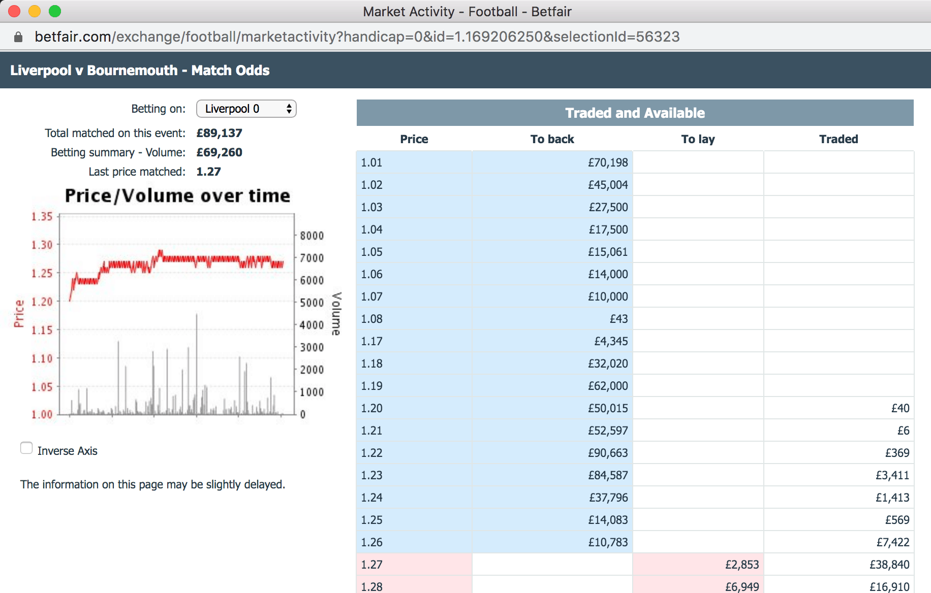
The same can been seen on the draw market for the same game. It is pretty static between 6.80 and 7.00
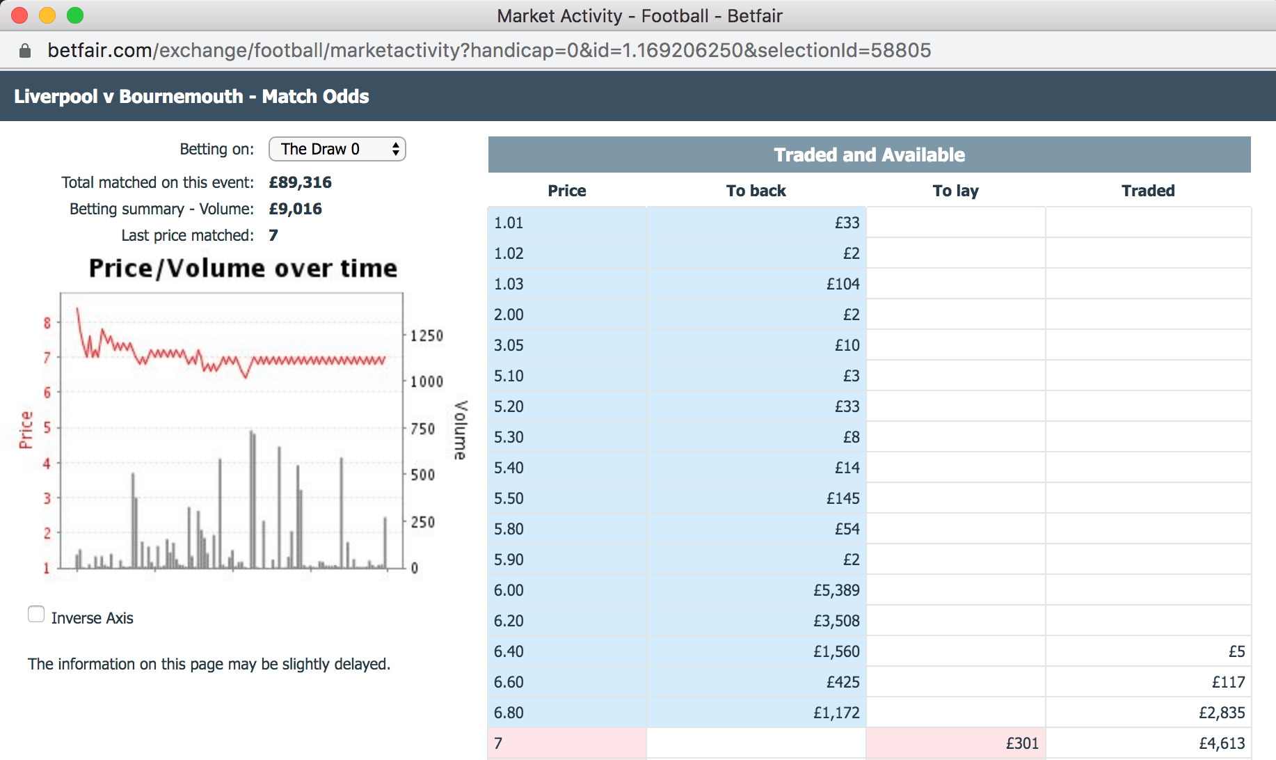
When a market is behaving like this, we can simply place a back bet 1 tick higher and, once matched, a lay price 1 tick lower. Effectively locking in 1 tick profit each time.
It can take time for you to get matched – these screenshots were taken from Friday morning – but theoretically, you could keep doing this over and over, making 1 tick profit each time.
There is more value to be had in the draw market (rather than Liverpool), as the tick gap is larger (6.80-7.00, rather than 1.26 to 1.27), so each tick will be worth more.
Then you can either hedge the bet for an equal profit on all outcomes. In this example, we would have made £2.94 per tick. If we did that 5, or 10 times over the 24 hours before the game, we could make up to £30.00 profit before a ball has been kicked.
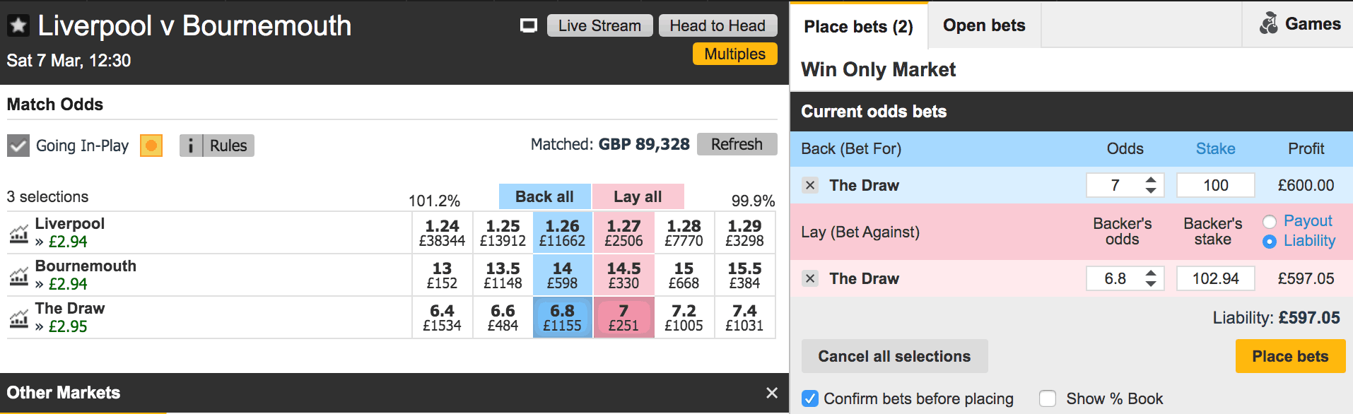
Alternatively, you can create a situation whereby you have a free bet on the draw. Less likely to collect, but when you do collect your profit and margins will be higher.
Hopefully by now you have a much stronger grasp of the Betfair Graphs, when they can be useful along with a couple of strategies on how you can use them to make real trading profits.
Enjoying this topic? Why not check out:
> How To Scalp The Betfair Markets
> What Causes Betting Odds To Move?
> Reading Betfair Graphs Like A Pro Trader